video
Video block with a poster preview and a centered play button. One component drives three players — YouTube, Vidyard and a native HTML5 <video> tag — switched purely through data-* attributes, with no markup changes.
Choosing the player
Set data-video-service to youtube, vidyard or html5. The matching player API (YouTube IFrame API / Vidyard embed v4) is injected automatically once per page; html5 needs no external script.
data-video-service— required. Player provider:youtube,vidyardorhtml5.data-video-id— required for YouTube/Vidyard. The YouTube video id or the Vidyard UUID.data-video-type— playback mode:lightboxopens the video in a modal,inlinereplaces the poster in place. Note: "inline" is not used on the project — for reference only.data-video-use-hash— value written to the URL hash when the video opens; on load, a matching#hashauto-opens the video (shareable deep link).data-video-url-params— extra query params appended to the Vidyard source (Vidyard only).data-html5-url— video file URL for thehtml5service (used as the<source>).data-html5-poster— poster image for thehtml5<video>element.
video with poster preview — Vidyard
Vidyard variant — data-video-service="vidyard".
How Vidyard works here
With data-video-service="vidyard" the Vidyard embed script (play.vidyard.com/embed/v4.js) is loaded once per page. The poster you see is static markup; on click the component builds a Vidyard inline player (data-uuid, data-v="4") and plays it — in a modal for data-video-type="lightbox" or in place for inline.
data-video-id— the Vidyard UUID of the video (e.g.Yvqb6BDiUHxdUwXvfqiyHv), not a numeric id.data-video-url-params— Vidyard-only. Appended as a query string to the embed source//play.vidyard.com/<uuid>.jpg?<params>and read by the Vidyard script as player options — e.g.autoplay=1&muted=1&loop=1. Pass it without a leading?.duration— optional runtime badge in the bottom-right corner of the poster (e.g.1:32, shown below). Works with every service; omit it for no badge.

video with poster preview — YouTube
YouTube variant — data-video-service="youtube".
How YouTube works here
With data-video-service="youtube" the YouTube IFrame API (youtube.com/iframe_api) is loaded once per page. The poster is static markup; on click the component creates a YT.Player and plays it — in a modal for data-video-type="lightbox" or in place for inline. Playback is controlled through the IFrame API (playVideo / pauseVideo).
data-video-id— the YouTube video id (e.g.SmOss5qe8eg), the part afterv=in a watch URL.data-video-url-params— ignored for YouTube (it only applies to Vidyard).
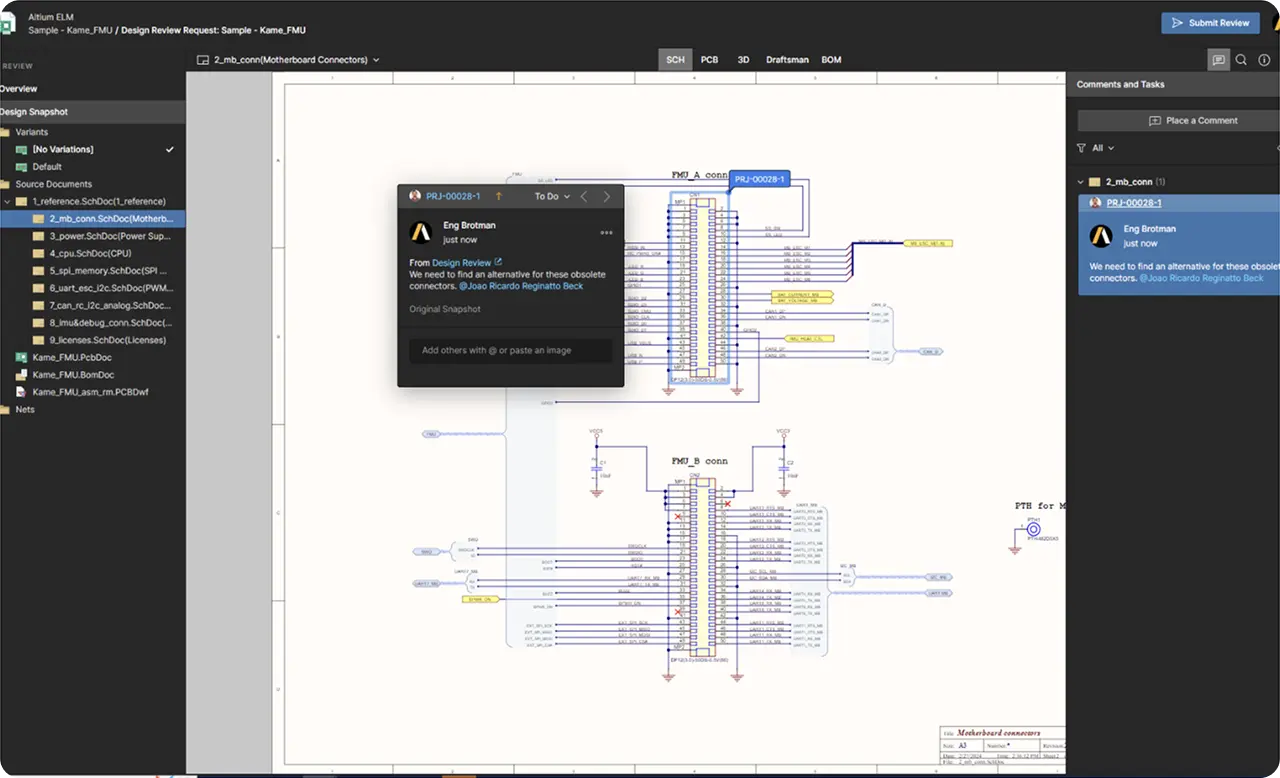
video with poster preview — html5(Video)
HTML5 variant — data-video-service="html5".
How HTML5 works here
With data-video-service="html5" the video is self-hosted — no external player or script is loaded. The poster is static markup; on click the component builds a native <video controls> with a <source type="video/mp4"> and plays it — in a modal for data-video-type="lightbox" or in place for inline.
data-html5-url— required. The MP4 file URL used as the<source>of the<video>.data-html5-poster— poster image shown on the<video>element before playback.data-video-id— any unique key (e.g.html5-demo-1); it identifies the generated modal, so give each html5 block a distinct value.data-video-url-params— ignored for html5 (it only applies to Vidyard).
video — video preview — caption — hash
Rare, special-case options — for reference only. This YouTube example swaps the poster image for a looping video preview and combines a caption under the play button with a shareable deep link (data-video-use-hash).
Video preview instead of a poster
Pass videoSrc — an MP4 filename from src/videos — and a native <video> is layered over the preview area. Everything else is unchanged: the play button, the caption and the duration badge sit on top of it, and a click still opens the real player (YouTube here) in a lightbox. The clip is decoration only — it plays muted and looped, with no controls, so the whole area stays clickable. Works with every service (youtube, vidyard, html5) and with both lightbox and inline.
videoSrc— optional, and it takes either form: a full URL (https://…or protocol-relative//…) is written into the<source>as-is, anything else is treated as a filename insrc/videosand resolved by webpack. The URL form is the production case — the file is served from the CDN (cdn-shared.altium.com/…/altium_designer_new/videos/…), which is what the example below uses; the local form is for prototyping. Omit the key and the block renders the poster image as before.poster— required together withvideoSrc, and it does two jobs. The<img>stays in the flow but invisible (tw-invisible), so the image alone defines the height of the block — swap the image and the box changes with it, no matter what the MP4 turns out to be. The same file is reused as the<video poster>, so it costs one request and shows through whenever autoplay is blocked or the video fails to load. Without aposterthe wrapper falls back to a16/9box (aspect-video).posterWidth/posterHeight— the intrinsic pixel size of that image, printed aswidthandheighton the invisible<img>. The browser reserves the box from those two numbers before the file arrives, so the content below does not jump when it loads. Nothing has to be built on the Drupal side for this — an image field already stores the width and the height together with the file, and core prints both attributes on the<img>by itself (plain image formatter and responsive image alike). No extra fields, no template work. The two numbers in the JSON only stand in for that here, because the prototype has no CMS behind it; they are the real size of the placeholder file, and wrong numbers would reserve a wrong box and bring the jump back.- The video is layered on top —
absolute inset-0 size-full object-cover— so a clip whose ratio differs from the image is cropped, never letterboxed, and the play button, caption and duration badge keep sitting over the same box. - Attributes rendered on the tag —
preload="auto"mutedautoplayloopplaysinline.mutedis what makes autoplay allowed in Chrome/Safari,playsinlinekeeps iOS from opening the clip fullscreen, andcontrolsis intentionally not rendered. - Keep preview clips short and light — they start downloading with the page. Corners are rounded to 16px —
rounded-2xlplusoverflow-hiddenon the wrapper, since a<video>is not clipped by the radius on its own.
Caption & hash
Both are optional and rarely used together. Pass caption to render a label under the play button, and useHash to attach data-video-use-hash — a slug written to the URL hash when the video opens; on load a matching #hash auto-opens the player (YouTube / Vidyard only).
caption— text shown under the play button (e.g.Watch Video). Omit it for no label.data-video-use-hash— deep-link slug (e.g.#watch-video). Waits foronYouTubeIframeAPIReadybefore triggering.
video lightbox
With data-video-type="lightbox" the video opens in a modal overlay on click. No poster preview is required — any button inside ._use-on-click becomes the trigger, so a video can be launched straight from a plain button. Below: Vidyard, YouTube and HTML5, each opening in a lightbox.
video inline
Important: this variant is not currently used on the project — it is here for reference only.
With data-video-type="inline" the player is embedded in place of the poster instead of opening a modal. On click the component injects the player into the .b-video block, hides the preview and keeps the video right in the page flow — the page is never dimmed by an overlay.
Why use inline
lightbox opens the video in a modal overlay over a dimmed page; inline swaps the poster for the player in the layout itself. Use it when the video is part of the page content (a featured/embedded video) and a modal would be disruptive — the surrounding content stays visible and the player keeps its place in the flow. It works the same for every service (youtube, vidyard, html5) — only data-video-type changes.